Parkland Remodel

The Parkland Remodel project is one of my favorite Before and After projects from 2019! I cannot believe the transformation. We didn’t make many changes layout wise to this one. The space was functional but in desperate need of an update and some minor tweaks. Today I want to also talk about my process and how I take my clients through it so that they LOVE their new kitchens.
My Design & Project Guiding Principles.
It is all about collaboration.
I don't JUST design kitchens & baths, I guide you through the design/selection process, I become your trusted advisor. I know my industry and stay up to date on the best products and solutions available. You know your lifestyle, what you want and what you hate about your current space but don’t necessarily know what the options or costs are.
As a bonus, I have a custom cabinet shop that will bring the most obscure ideas and styles to life.
Together we decipher your vision so that you can spend the time enjoying your newly remodeled space - not worrying about making mistakes or blowing your budget.
How do I do this?
I design in a specific order, and most importantyly WITH my client sitting in front of me.
Functionality: Together we discuss what isn’t working and what you want. We build a live 3D rendering of your space so you can see how each change improves the functionality of your space.
Planned Investment: We discuss costs openly and honestly. While we design we are budgeting against your planned investment. No matter how gorgeous your kitchen is, if you can’t actually afford it, what good is it?
Design & Style: Now you have a sense for what your space will look like, but how will it feel? We go through our Design Studio and touch and feel the cabinets, test the hardware. We look at samples and pull together a palette of flooring, cabinetry, quartz, tile, fixtures, wall paint and hardware.
Lets take a look at how my process transformed the Parkland Remodel Project.
Functionality.
Everyone uses their kitchen differently. It doesn’t matter how good of a deal your kitchen cabinetry was, if it doesn’t fuction for you once the reno is over, you will never be happy with it.
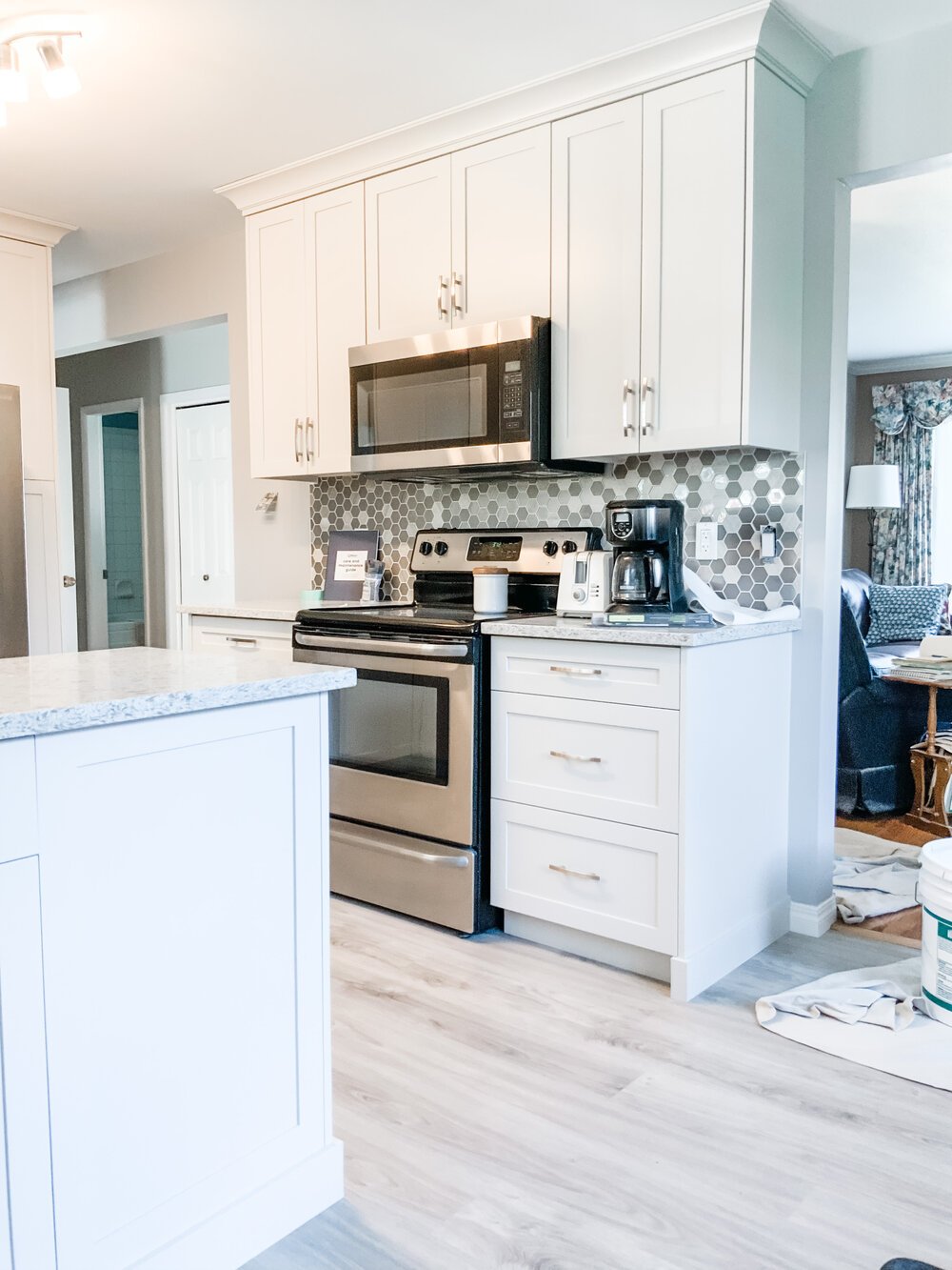
Functionality Issue #1 - The Stove Wall.
We had to deal with the stove wall. The countertops on either side where less than 12” wide and not practical workspace. To make it worse, they were set in about 9” on either side, wasted space.
Solution: Make Space.
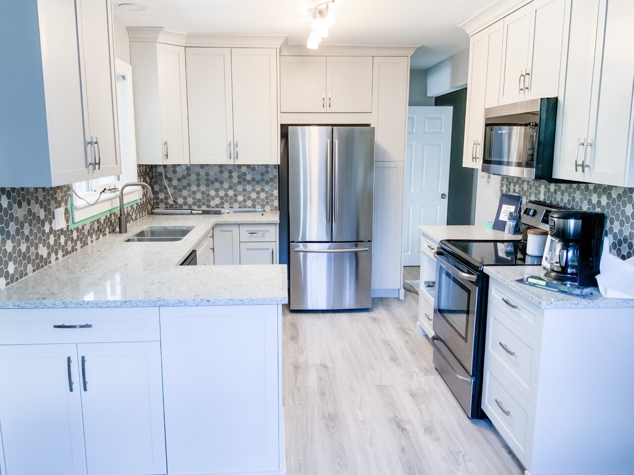
We gained workspace around the stove by extending the wall another 16” to the right. This created a more symmetrical room by lining up the walk ways to the living room and dining room (not pictured.) We extended the counter on the right to line up with the outside edge of the peninsula.
In the end we had about 25” of counter space on each side of stove. Way more functional!
Functionality Issue #2 - Counterspace.
This kitchen does not have a lot of counter space. The owners have their appliance essentials readily available on the counter; however, with the upper cabinets not meeting code requirements, the issue compounded. Many appliances could not tuck back neatly because they did not fit under the uppers and it created pockets of clutter.
Solution: Combine & Relocate.
To save counter space on the u-shaped sink side of the kitchen we changed out the counter top microwave for an over the range microwave/fan combination. We new simply changing the cabinetry would solve the code issue as all of our cabinet installs meet industry standards and NKBA Kitchen Planning Guidelines.
Planned Investment.
Throughout the process we discuss the impact that things will have on the clients planned investment. For example, changing up the stove wall will add a couple thousand dollars to extend, address electrical and change the venting on the hood. However, the gains certainly outweighed the cons here. More counterspace to work on and more storage space below. In order to stay on budget the owners decided that they would do the demolition themselves and remove the cabinets and the bulkhead.
Many clients are very reluctant to share their budgets with us. I get it, it’s personal and vulnerable to share that information.
I can assure you, we are not like that. We are here to be your trusted advisor and guide you through making educated decisions. It is very hard to do that if we do not know where the boundaries are.
Design & Style.
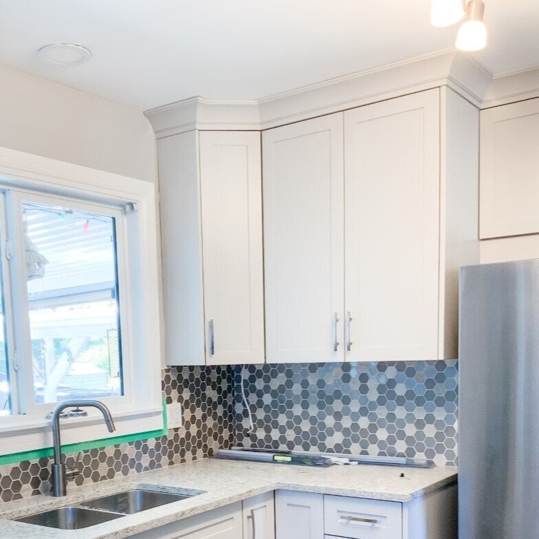
The Fridge Wall.
One of the first things I knew we needed to fix was the section where the fridge sits. The stairs to the basement go behind the fridge and then turn and go down towards the kitchen. This creates an awkward set back wall where the counters end and the the fridge sits. None of the cabinetry or mouldings line up and there are a whole lot of weird corners and lines going on. Since this wasn’t meant to be a major reno, there was nothing we could do structurally to change this.
The best option was to work some cabinet magic and distract from the awkwards lines. First to go was the bulkhead so that we could extend the kitchen cabinets to the ceiling. This extra height will add a ton of storage to this small sized kitchen.
We custom sized the upper cabinets so that we could get them to the very edge of the wall. Once the end panel was added (which we oversided) the lines of the wall and cabinetry were blended and smooth. This allows the crown moulding at the top to be continuous.
Next we increased the depth of the fridge and pantry cabinets so that the cabinet over the fridge is easily accessible from standing in front. This helped to camoflague the depth difference.
Here’s a better closeup of the difference:

The Sink Wall.
The sink wall was the last section that we focused on. Because of the sink and dishwasher, there was not a lot we could do to change the flow of things here. The changes really came down to removing the old bulkhead and updating cabinetry.
What a differnce removing the bulkhead made to the the amount of light coming into the room!
Speaking of lighting, we relocated the light in the bulkhead up to the ceiling. We also took down the old school oak light box and replaced it with a track light. A fresh coat of white on the ceiling got rid of the last golden, yellow tones.


Now that the flow, functionality and key style elements have been addressed its time to actually pull together the palette of finishes and fixtures. It is important to remember that once a fixed element is chosen each remaining decision has only 1-3 options that will work. The world is not your oyster and the possibilities are not endless.
The Flooring
The old lineoleum had to go. We chose a beautiful rich oak vinyl plank.
The Cabinet Colour
We pulled the cabinet colour out of the flooring. It is a soft, greige colour.
The Quartz Top
Next we analyzed our counter options. The homeowners were set on having an undermount sink so laminate was instantly ruled out. Since we had a budget to work with we started with our Studio Quartz Collection. An exclusive line of quartz only available in our studio. We found the color almost instantly. It just POPPED with the cabinets and flooring.
The Backsplash
The backsplash really adds personality and character to a space. It’s a great place for homeowners get to express themselves. Whether they want something simple and subtle or dramatic and colourful, there are so many options. Some clients leave this decision until the end of the install so that they can feel the new space and decide what it needs.
Some clients see a backsplash and KNOW its the one. That is exactly what happened with this. The metallic in the hexagon pattern brought the appliances and handle hardware together and it was just the perfect option.
See the full Gallery:

Explore More Articles: